Chryssa Vardea-Mavromichali
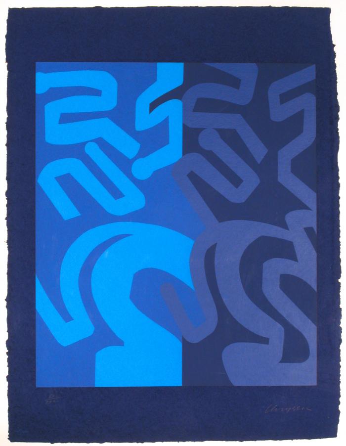
Untitled from Gates to Times Square , 1978
Artwork Type: Prints
Medium: Color screenprint
Dimensions: 41 x 30 in. (104.14 x 76.2 cm)
Accession #: 19810787
Credit: Collection of University Art Museum, University at Albany, State University of New York on behalf of The University at Albany Foundation, gift of Mrs. Ivan Radin
Related Exhibitions:
When We Were Young: Rethinking Abstraction From The University At Albany Art Collections (1967-Present)
Chryssa: Gates to Times Square
Copyright: © Chryssa Vardea-Mavromichali
Object Label:
Show Object Label(s)Chryssa used the same screens to print this work as she did for Gates to Times Square (Red,
Fuschia, Blue), thus maintaining the same shapes and compositional structure and only
changing the colors. That is, all but one color: the dark-blue lines on the right are printed in
the exact shade of blue as their counterparts in Red, Fuchsia, Blue. Repeating the identical
form and maintaining one color offers something like the control of a scientific experiment
and allows the artist to experiment with variable color interactions. In this case, the value of
the field behind the blue lines is much darker, making them appear lighter than in Red,
Fuchsia, Blue. At the same time, these two shades of blue are much closer in value than the
relatively higher contrasting blues on the left. Thus the separation between figure and
ground on the left becomes easier to read, apprehended in a moment.
–When We Were Young: Rethinking Abstraction From The University At Albany Art Collections (1967-Present)
Please contact us at dabbatiello@albany.edu to verify collection holdings and artwork information. If you are interested in receiving a high resolution image of an artwork for educational, scholarly, or publication purposes, please contact us at dabbatiello@albany.edu.
